I dedided to update my website in March.
A year and a half ago I was introduced to this awesome platform for website design called ShowIt. I fell in LOVE.
When I first started my business in 2007 I made my own site and I had a basic free blog on wordpress. Several re-dos and re-designs later I decided to completely kill the website and just do a blogsite. After all – those were becoming super popular at the time and updating one website seemed way easier then doing two. Only thing is we all know how awesome I am at keeping blogs up to date! Ha! ( did I mention that is a 2013 business goal?? Blog More! Make a nice workflow for blogging! blog blog blog! )
Anyway – I was introduced to ShowIt by the gorgeous Jasemine Star and thought hmm this platform is crazy! You can do whatever you want with it. At this point I decided I was going to go back to having a website that was just more pictures and more of a portfolio of the business and then I would have another site that was just the blog. No more blogsite for me.
I stared at the blank template for FOREVER on the new site. I finally just went with a pre-designed template and customized the heck out of it to fit what I wanted. I made minor tweaks here and there over the next 8 or so months. I came to the conclusion when I started to decide where I wanted the business to go in 2012 that I needed to redo the website. This started the grand adventure in March of redesigning. Again, I sat staring at the blank white page for days. I didn’t feel as intimidated this time since at least I knew the program this time, I knew what things did what, and I had a base for the graphics I liked already. I had already spent a couple months redesigning the client websites to match the new website. Those ended up being my test runs when I was trying to find a new design I liked. I fell in love with what I did for the client sites and that was my jumping off point for the main website.
Fast forward many trials, many nights of deleting – editing – trying that graphic there – wait… wait…. move it some more… delete that… change the color… oh gosh just scrap the whole format of the pictures and completely do a 180 on how I wanted the format of the galleries to be. Add pages…. delete pages…. add more pages and go back to delete older pages. It was a long process and it is FINALY DONE!!!!! YAYY!!!!!!!!!!
SOO – You want to see right? Right? RIGHT??? I thought so!
Go check it out!
Here is some of the crazy madness that went on –
The old layout – AKA The template that I customized the heck out of
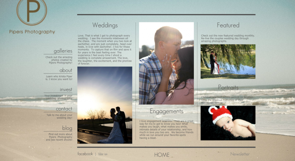
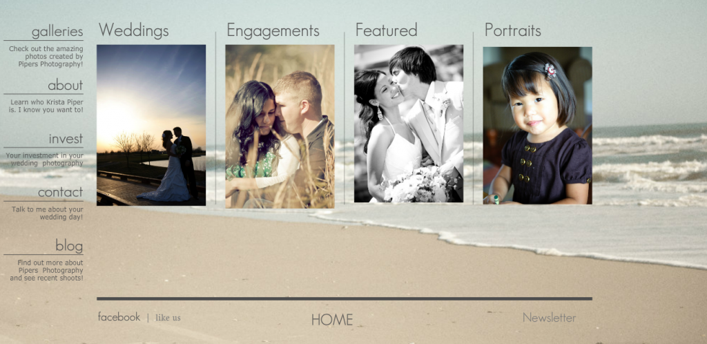
Trails and Errors
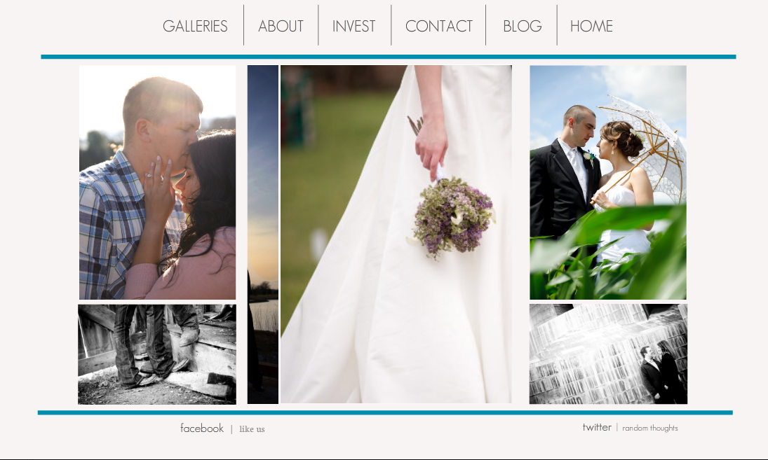
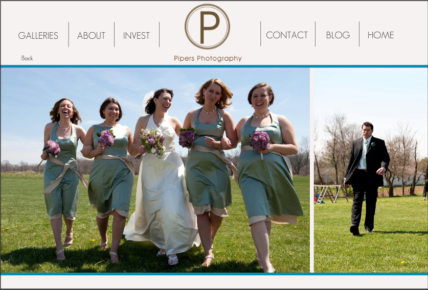
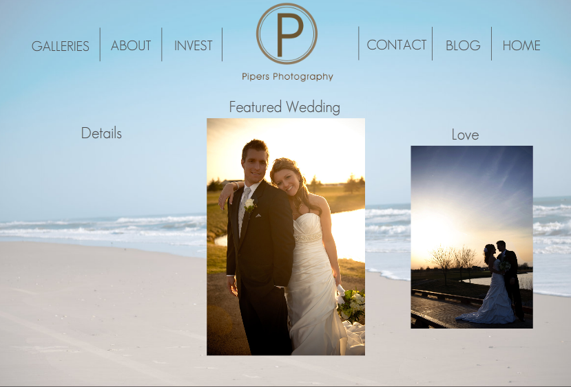
There will be changes happening on the blog as well over the next couple weeks to make it also match the website. Look for all these gorgeous new changes soon!
I am an Ohio based photographer who loves photographing weddings and engagements, traveling to beautiful sandy beaches, running after our adorable son Wyatt and border collie Bentley. A chips and salsa freak. Lover of coconut smelling lotions - candles - tea - desserts and... well anything that smells coconuty, and finally warm summer nights on our patio! Come hang out with me on Instagram and Facebook!
With Love,
Krista
Instagram
Facebook
Our 6 best tips for having a relaxed wedding day and an extra bonus that is near and dear to Scott and I. Grab our free guide to learn ALL about how to have a relaxed wedding day.
Grab The Guide
6 Tips for a relaxed wedding day
Grab the FREE GUIDE